Visualize and Compare Experiments
You can visualize and compare experiments using plots, images, metrics, etc. You can also export the project table as CSV, to use the data with any external reporting or visualization tool.
Display plots and images
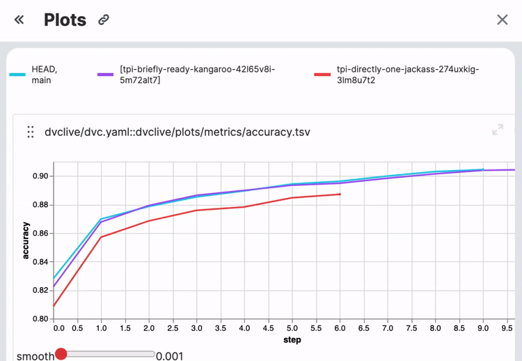
You can visualize certain metrics of machine learning experiments as plots. Some plot examples are AUC curves, loss functions, and confusion matrices. The easiest way to start is with DVCLive, which will automatically generate plots data and configure them to be visualized.
DVC Studio supports all DVC plots, which can plot two types of files in your repository:
- Data series files, which can be JSON, YAML, CSV or TSV. Data from these files will populate your AUC curves, loss functions, confusion matrices and other metric plots.
- Image files in JPEG, GIF, or PNG format. These images will be displayed as-is in DVC Studio.
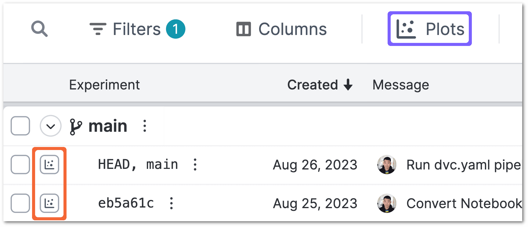
To open the Plots pane and display plots, select the plots toggle (highlighted
in orange below) for one or more experiments and click on the Plots button
(highlighted in blue below).
Live plots
You can send live updates to your plots with
DVCLive. The number of recent updates to the live metrics are
displayed
in the Live icon. Live plots are also shown and updated in real-time in the
plots pane along with all other plots.
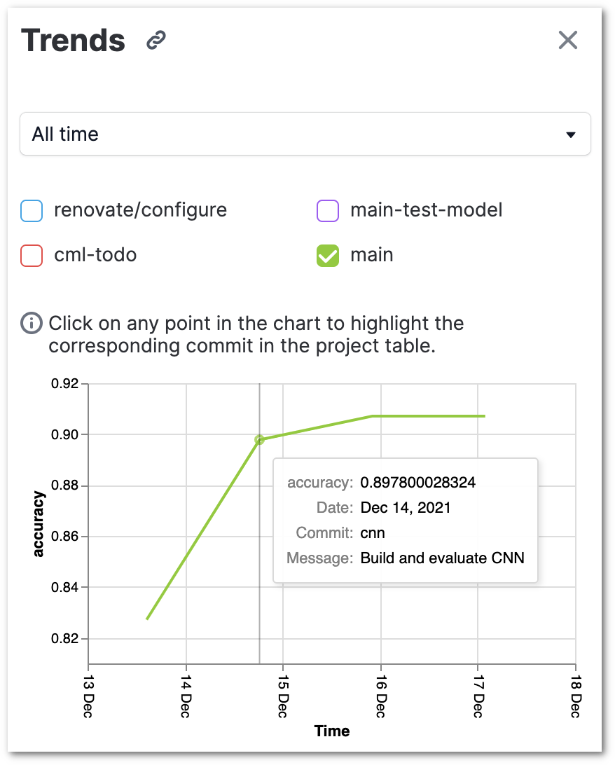
Generate trend charts
Click on the Trends button to generate a plot of how the metrics changed over
the course of the different experiments. For each metric, the trend charts show
how the metric changed from one commit to another. You can include one or more
branches in the trend chart, and branches that are currently hidden in the
project table are excluded.
Compare experiments
Select up to seven experiments and click on the Compare button. The metrics,
parameters and files in the selected experiments will be displayed side by side
for easy comparison.
