Visualizing Plots
DVC can generate and render plots based on your project's data. A typical workflow is:
-
Save plots data and define how to visualize the plot. The simplest way is to use DVCLive, which will save and define plots for you.
-
Run experiments and compare the resulting plots (the image below uses the VS Code Extension).

Supported plot file formats
To create valid plots files, you can:
- Use DVCLive in your Python code to log the data automatically in a DVC-compatible format.
- Generate a JSON, YAML 1.2, CSV, or TSV data series file yourself.
- Save an JPEG, GIF, PNG, or SVG image file to render directly in your reports (helpful for custom visualizations that would be hard to configure in DVC).
DVC generates plots as static HTML webpages you can open with a web browser or view in VS Code via the Plots Dashboard of the DVC Extension. (they can be saved as SVG or PNG image files from there).
For data-series plots, DVC expects to see one or more arrays of objects (usually float numbers) in the file. These are rendered using Vega-Lite (declarative grammar for defining graphics).
Tabular data
In tabular file formats (CSV and TSV), each column is an array. dvc plots
subcommands can produce plots for a specified column or a set of them. For
example, epoch, loss, and accuracy are the column names below:
epoch,loss,accuracy
1,0.19,0.81
2,0.11,0.89
3,0.07,0.93
4,0.04,0.96
You can configure how DVC visualizes the data (see dvc plots show):
$ dvc plots show logs.csv -x epoch -y loss
file:///Users/usr/src/dvc_plots/index.html
Hierarchical data
Hierarchical file formats (JSON and YAML) should contain an array of consistent objects (sharing a common structure): All objects should contain the fields used for the X and Y axis of the plot (see DVC template anchors); Extra elements will be ignored silently.
dvc plots subcommands can produce plots for a specified field or a set of
them, from the array's objects. For example, loss is one of the field names in
the train array below:
{
  "train": [
    { "accuracy": 0.96658, "loss": 0.10757 },
    { "accuracy": 0.97641, "loss": 0.07324 },
    { "accuracy": 0.87707, "loss": 0.08136 },
    { "accuracy": 0.87402, "loss": 0.09026 },
    { "accuracy": 0.8795, "loss": 0.0764 },
    { "accuracy": 0.88038, "loss": 0.07608 },
    { "accuracy": 0.89872, "loss": 0.08455 }
  ]
}
You can configure how DVC visualizes the data (see dvc plots show):
$ dvc plots show train.json -y loss
file:///Users/usr/src/dvc_plots/index.html
Defining plots
In order to create visualizations, users need to provide the data and
(optionally) configuration that will help customize the plot in a dvc.yaml
file. If you are using DVCLive, it will configure plots, but
you can also add your own custom plots. The easiest way is to use the
DVC Extension for VS Code
to define plots inside your dvc.yaml.
Along with defining plots, the extension can make plot debugging easier.
You can also manually edit dvc.yaml to configure plots like this:
plots:
  # Data series source
  - eval/live/plots/sklearn/cm/test.json:
      # Configure template and axes.
      template: confusion
      x: actual
      y: predicted

  # Multiple data sources
  - ROC:
      x: fpr
      y:
        eval/live/plots/sklearn/roc/train.json: tpr
        eval/live/plots/sklearn/roc/test.json: tpr

  # Image file source
  - eval/importance.png
  # Directory of images or data sources
  - eval/misclassified_examples
In the simplest use, you only need to provide the plot's file path. In the
example below, DVC will take data from logs.csv and use the default plotting
behavior (apply the linear plot template to the last found column):
plots:
  - logs.csv
$ dvc plots show
file:///Users/usr/src/dvc_plots/index.html
For customization, we can:
- Use a plot ID (
ROC) that is not a file path. - Specify one or more columns for the
x(fpr) andy(tpr) axes. - Specify one or more data sources (
evaluation/train/plots/roc.jsonandevaluation/test/plots/roc.json) as keys to thexandyaxes. - Specify any other available configuration field (
title,template,x_label,y_label).
plots:
  - ROC:
      x: fpr
      y:
        evaluation/train/plots/roc.json: tpr
        evaluation/test/plots/roc.json: tpr
      title: Train vs. Test ROC
      x_label: False Positive Rate
      y_label: True Positive Rate
$ dvc plots show
file:///Users/usr/src/dvc_plots/index.html
Refer to the full format specification and dvc plots show for more details.
Plot templates (data-series only)
DVC uses Vega-Lite JSON specifications to create plots from user data. A set of built-in plot templates are included.
The linear template is the default. It can be changed with the --template
(-t) option of dvc plots show and dvc plots diff. The argument provided to
--template can be a (built-in) template name or a path to a custom
template.
For templates stored in .dvc/plots (default location for custom templates),
the path and the json extension are not required: you can specify only the base
name, e.g. --template scatter.
DVC has the following built-in plot templates:
linear- basic linear plot including cursor interactivity (default)simple- simplest linear template (not interactive); Good base to create custom templates.scatter- scatter plotsmooth- linear plot with LOESS smoothing, see exampleconfusion- confusion matrix, see exampleconfusion_normalized- confusion matrix with values normalized to <0, 1> rangebar_horizontal- horizontal bar plot, see examplebar_horizontal_sorted- horizontal bar plot sorted by bar size
Note that in the case of CSV/TSV metrics files, column names from the table header (first row) are equivalent to field names.
Refer to dvc plots templates for more information on how to prepare your own
template from pre-defined ones.
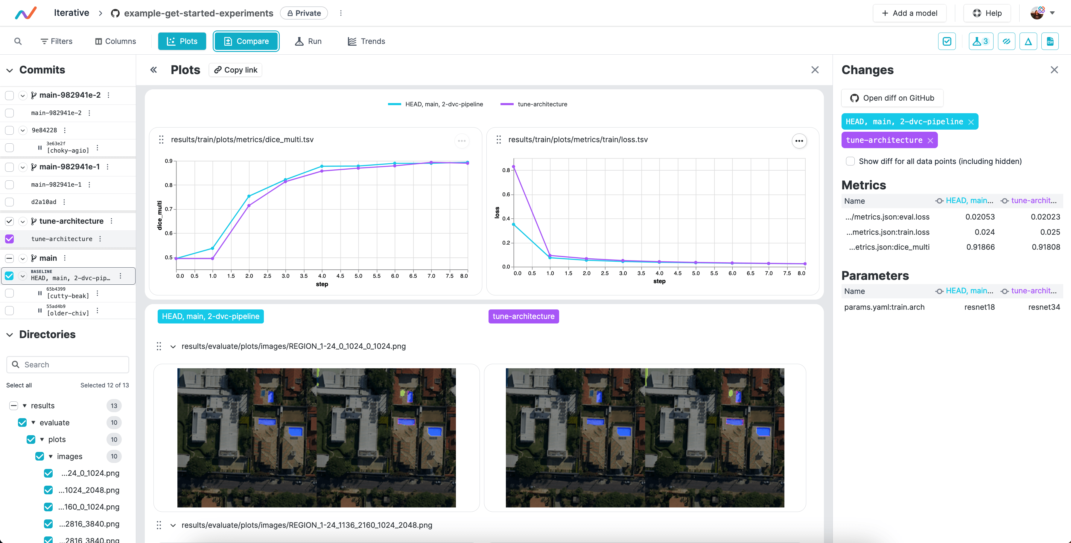
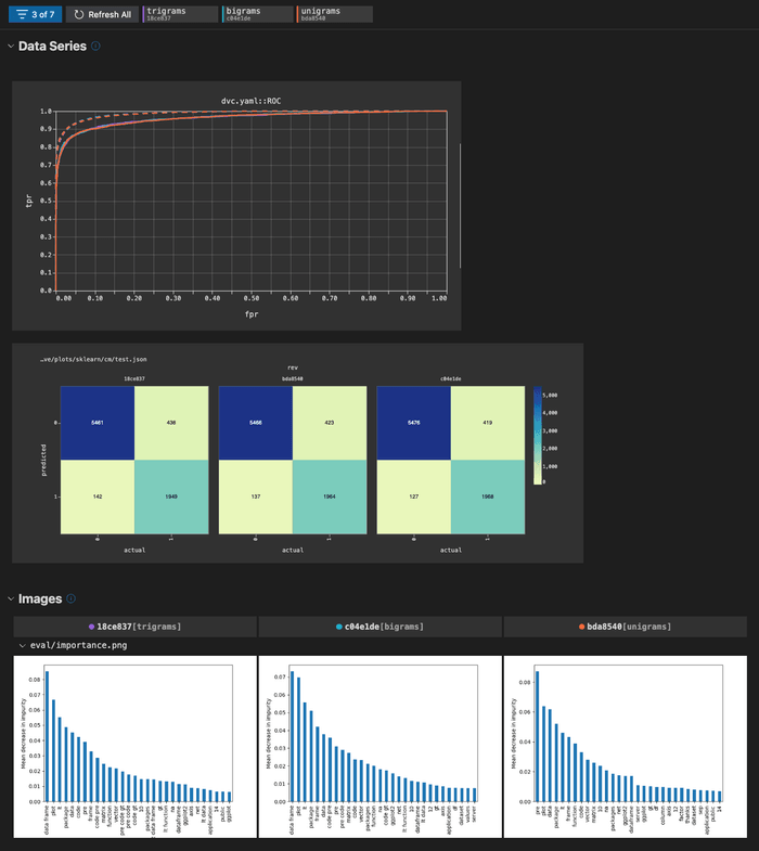
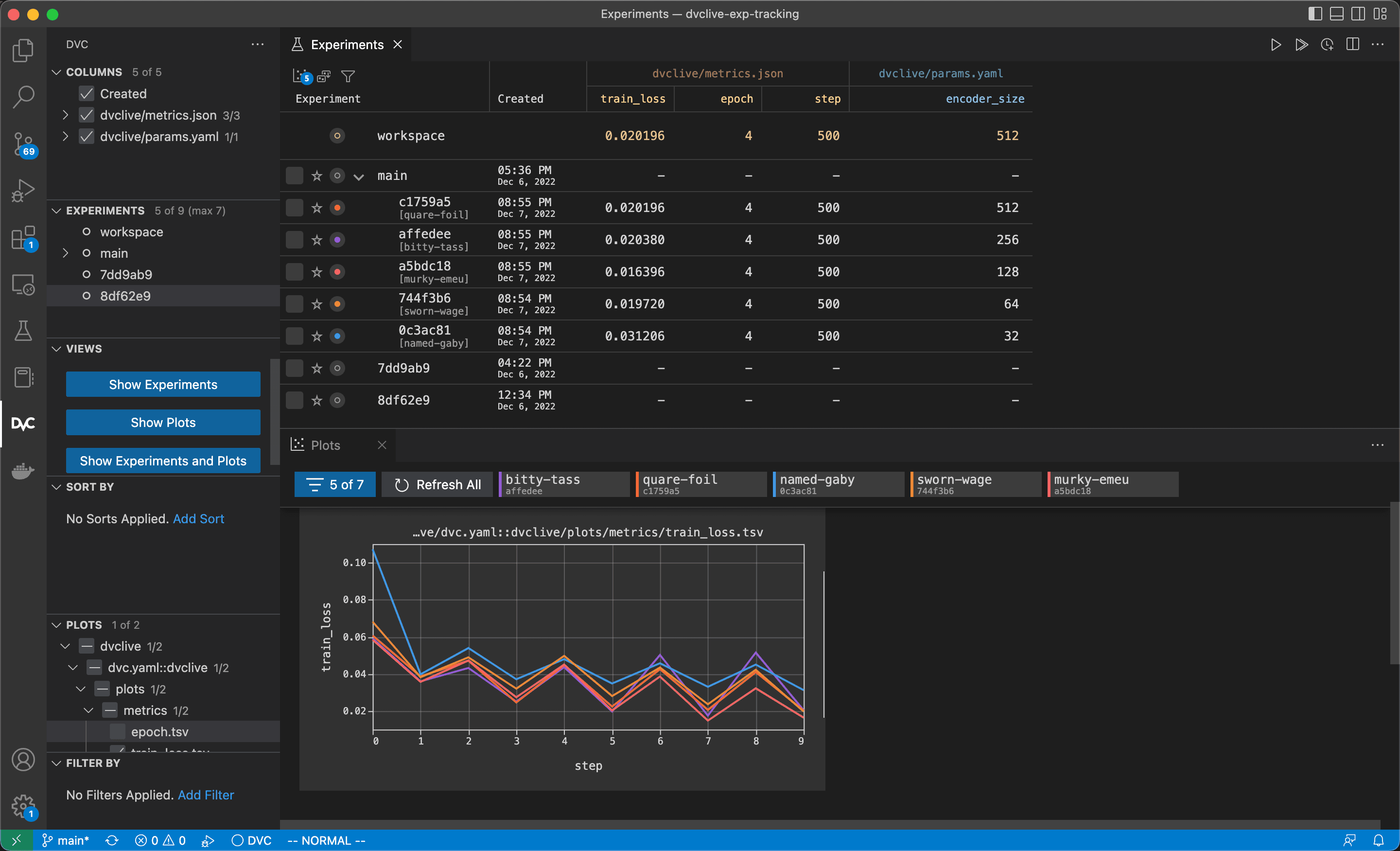
Comparing plots
When you run experiments or otherwise update the data in the plots files,
those updates will be automatically reflected in your visualizations. To
compare between experiments or Git revisions, you can use dvc plots diff,
the plots dashboard from the VS Code Extension, or [DVC
Studio] to share with others.
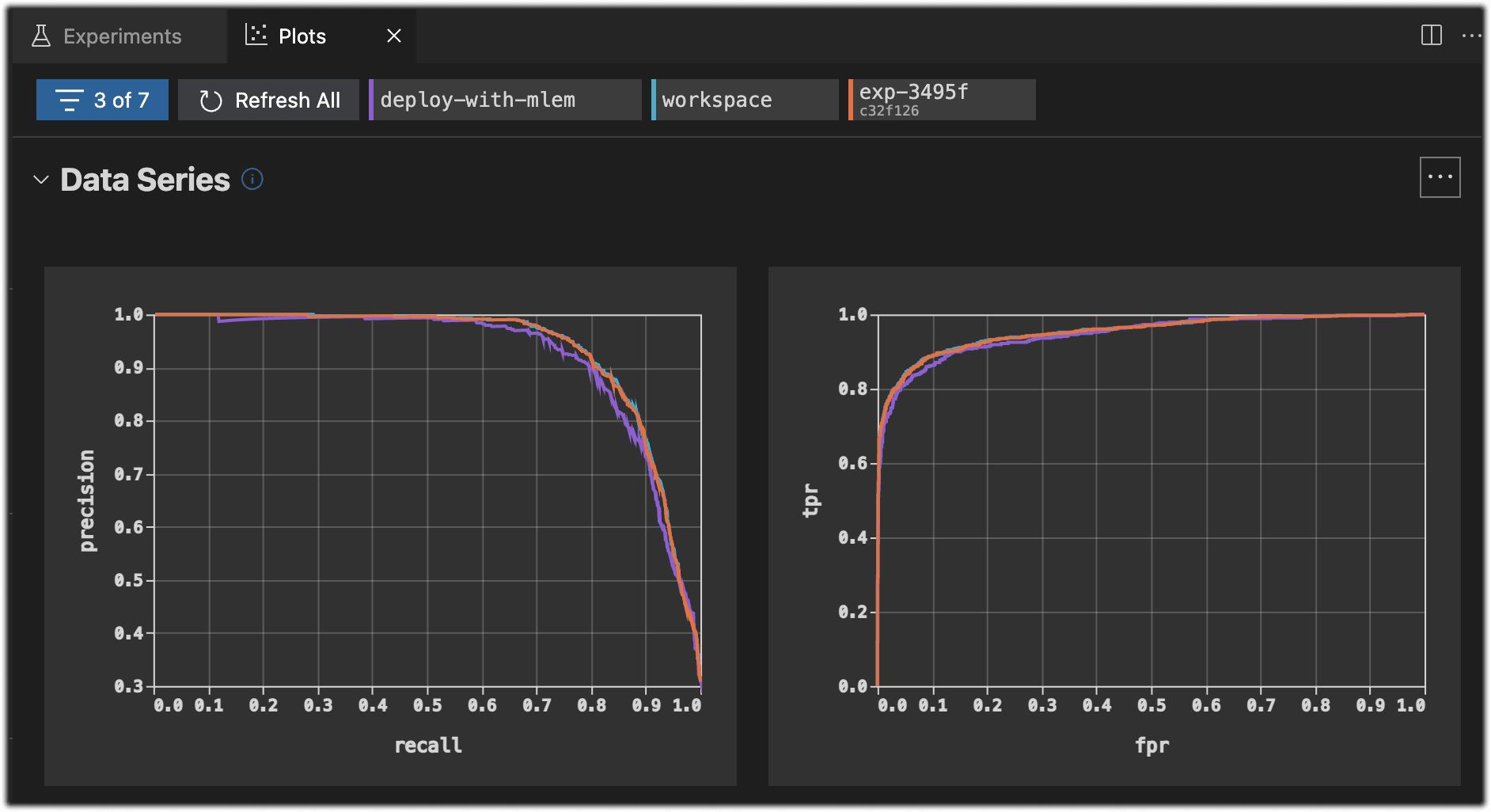
You can use dvc plots diff to compare plots across experiments.
$ dvc plots diff $(dvc exp list --name-only)![]()
Inside the
DVC Extension for VS Code,
you can compare in the
Plots
view.
Once you have shared the results to DVC Studio, you can compare experiments against the entire repo history: